New cu.edu more responsive to users – and devices
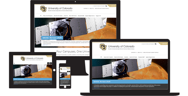
The University of Colorado’s systemwide website, www.cu.edu, has relaunched with changes designed to be more responsive to faculty, staff, students and the public – and more responsive to their web-browsing devices.
The culmination of roughly two years of research and development, the website redesign was led by University Relations in the Office of the President, in conjunction with representatives of system departments and staff and faculty governance groups.
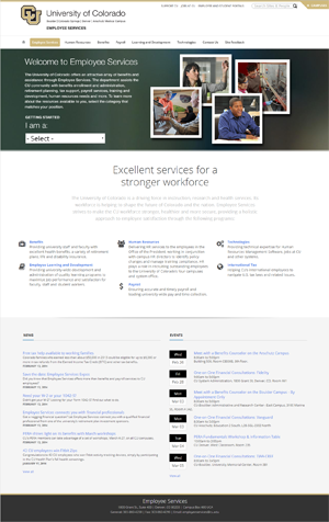
Research showed that the site’s primary users are faculty and staff, followed closely by prospective students and their parents – who are directed to the campus websites. The cu.edu site is a hybrid website, with part dedicated to promoting the university, part to facilitate interaction between vendors and other external groups, and part to allow employees to do their personal business with the university.
Boulder-based design firm Archetype 5, which previously had led Web design for the University of Arizona and CU’s Center for Public Health Practice, completed the work.
Developers took a “mobile first” approach to designing the site, taking into consideration technologies that people use to access the Web now and in the future. On any given page, the images and text on the screen automatically shift based on whether the browser is on a phone-size screen, a tablet, or a laptop or desktop monitor. Elements are resized and restacked to enable easy access to applications and information.
Another technological improvement was among the most requested from faculty and staff: a more robust, integrated search function. When users search the name of a faculty or staff member – from any campus or system administration – they’re provided with links to content containing the name, as well as contact information. The site also enables powerful keyword searches of university policies. The search function – a window labeled “Search Sites & People” -- is fixed atop each page.
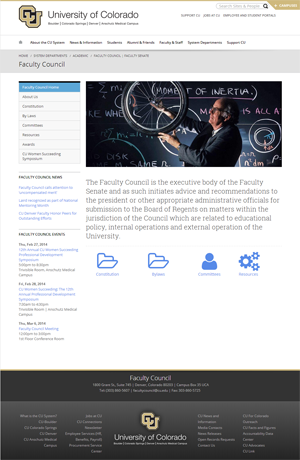
Besides presenting a sleeker face and improved functionality for users, the back end of the website is vastly improved. Staff members who work on the site behind the scenes have been empowered with more nimble, versatile control of content. Built on a Drupal content management system, the new cu.edu enables shared management of pages, with individual offices and departments better able to create and update their own content. That content is more easily shared across multiple pages of the site, too.
Such integration also makes possible more precise site analytics, which will help inform better understanding of traffic patterns across the many pages.
During this month’s soft launch of the site, cu.edu has attracted 60,147 unique visitors, resulting in 222,167 pageviews.
“We had a great team of system employees building the content while our vendor and their team executed the complex, and in some cases groundbreaking, development work to make this system a reality,” said Jon Arnold, University Relations web developer, who acted as staff lead and liaison to the vendor. “Together, we’ve input tens of thousands of content items into the new system.”
The site is groundbreaking in that one instance of Drupal was siloed into individual, organic groups, allowing for different users, navigations, page layouts and features for various departments.
The system was developed to be extremely flexible to immediate changes to the live environment, and was built in such a way so as not to require a large-scale redevelopment every four or five years.
Faculty and staff with questions or comments about the new cu.edu may contact Jon Arnold, jon.arnold@cu.edu.


